Part 1
Tap to open the first page and follow my journey through my first phase of the internship. There’s no text with Part 1, unfortunately, though I’ll explain each exhibit here.
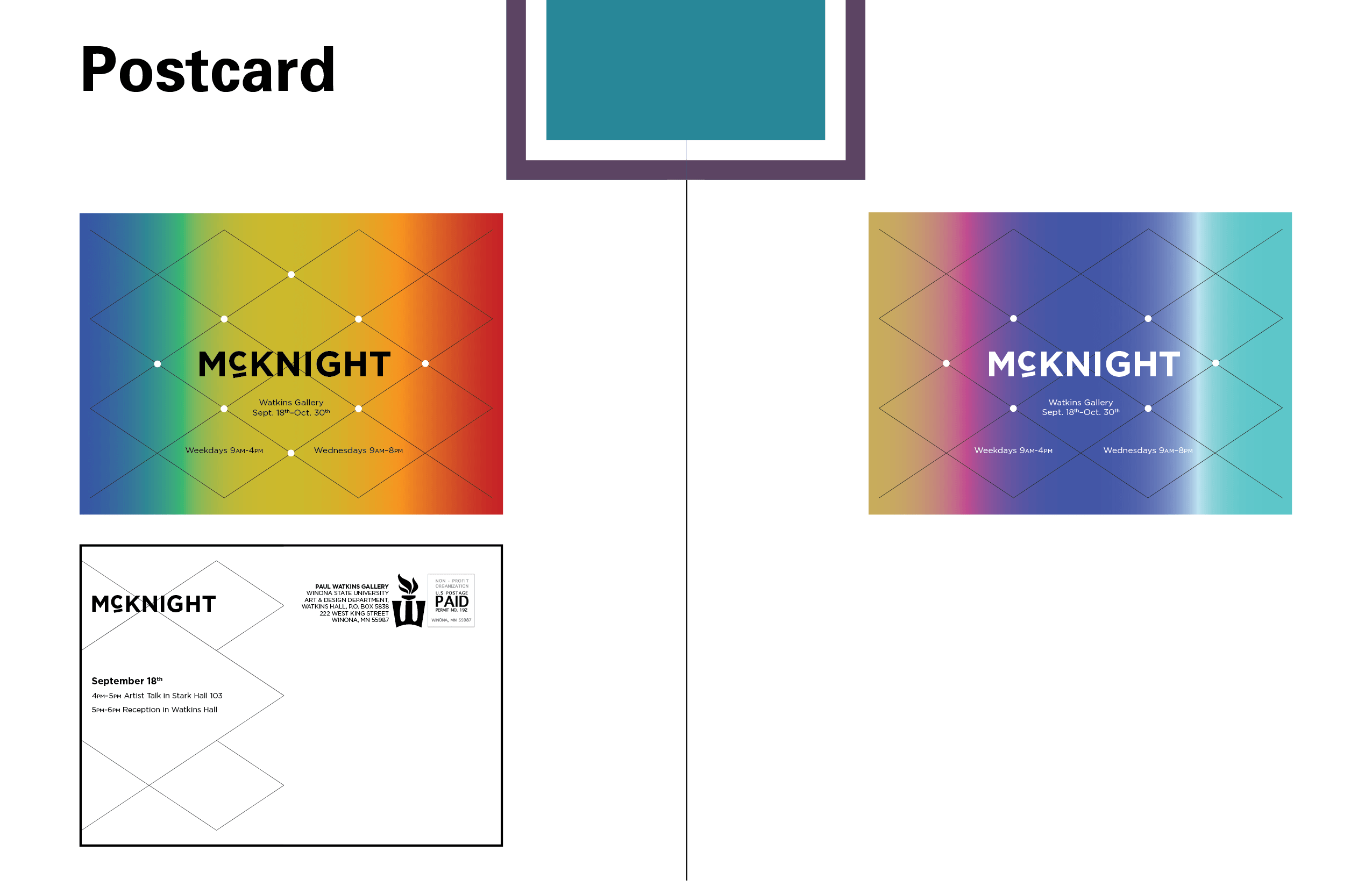
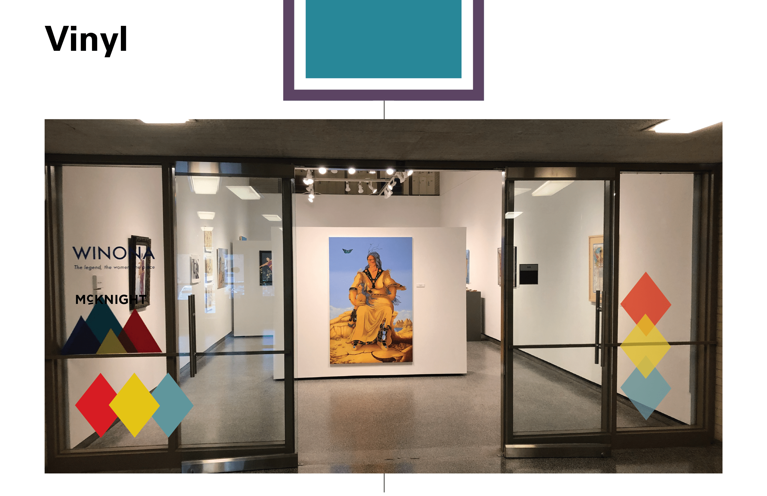
1. McKnight was the first exhibit that I worked on as an intern. It was the least successful, most educational, and one of the most involved production of my time as an intern.
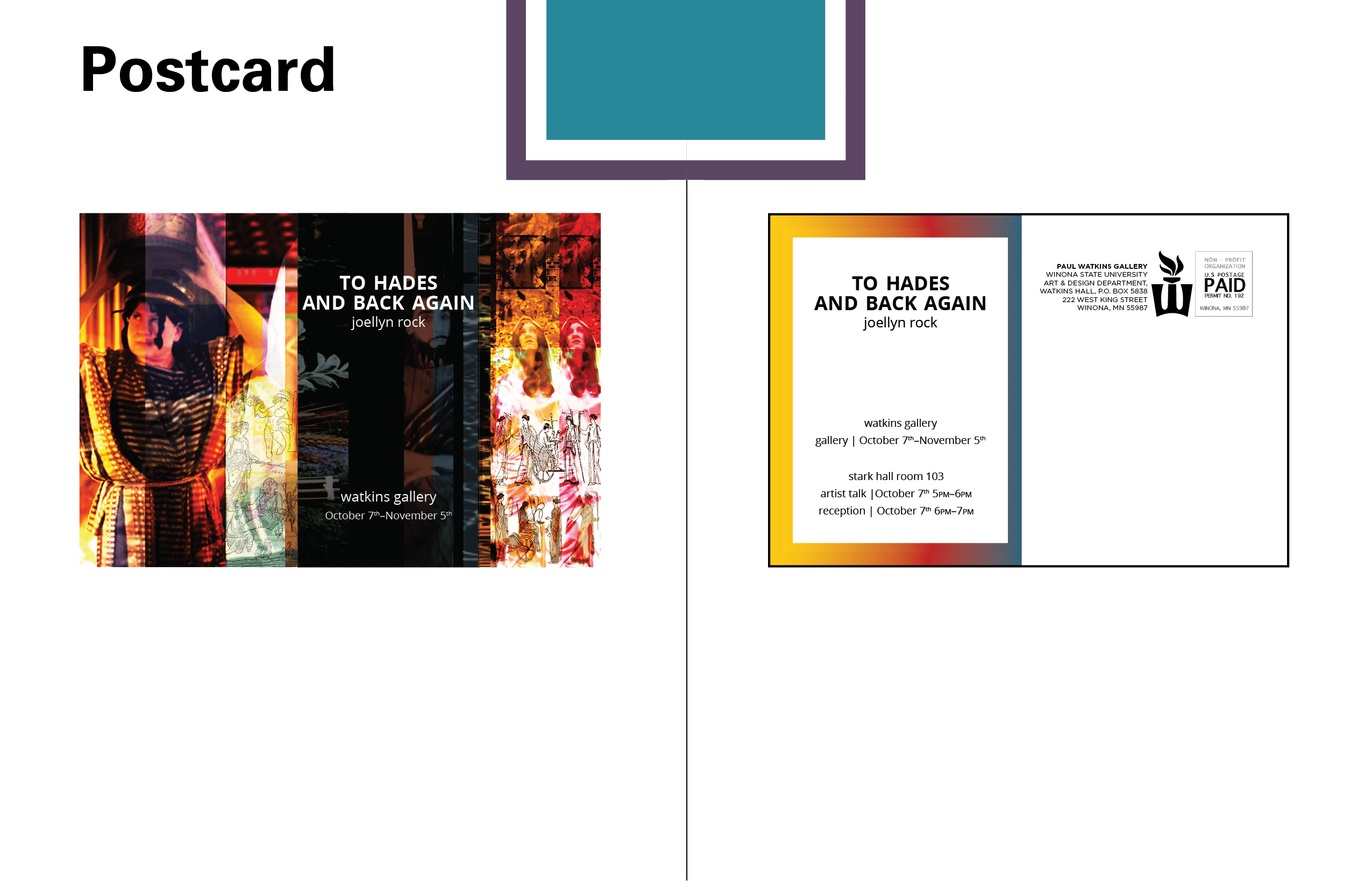
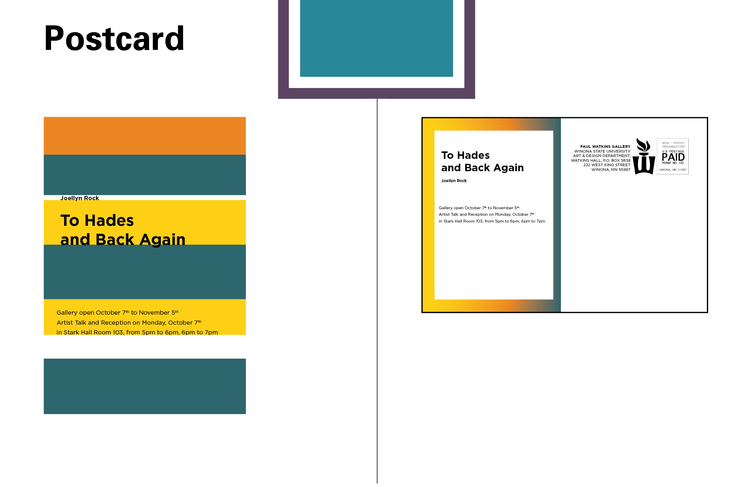
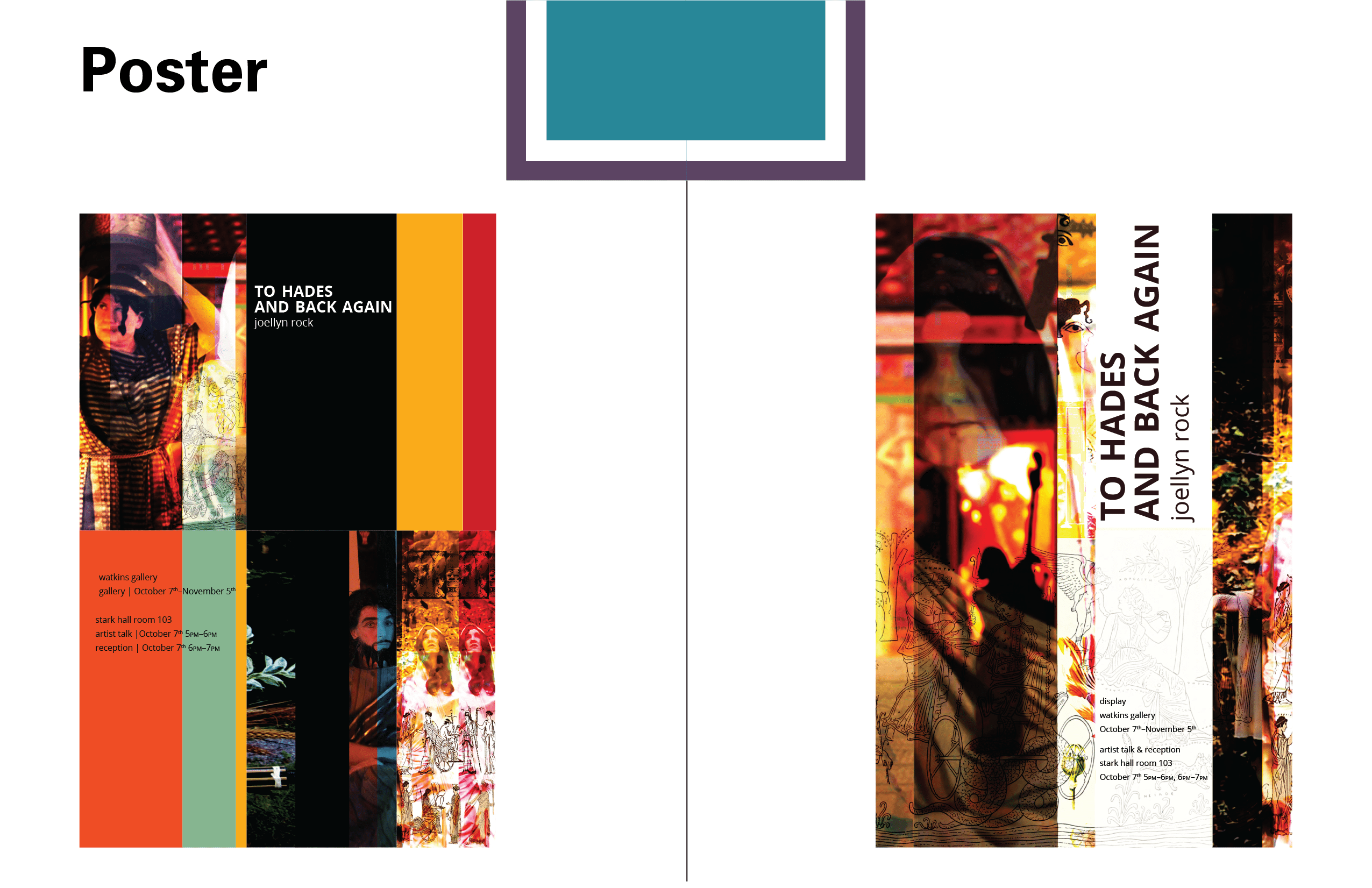
2. To Hades And Back Again, as my second project, was when I started to think outside the box a little bit more. With my first postcard proposals, I went with one image-based and one vector-based design, a method that I’d carry through to the end (exhibit allowing) even if the concepts didn’t make it on this report.
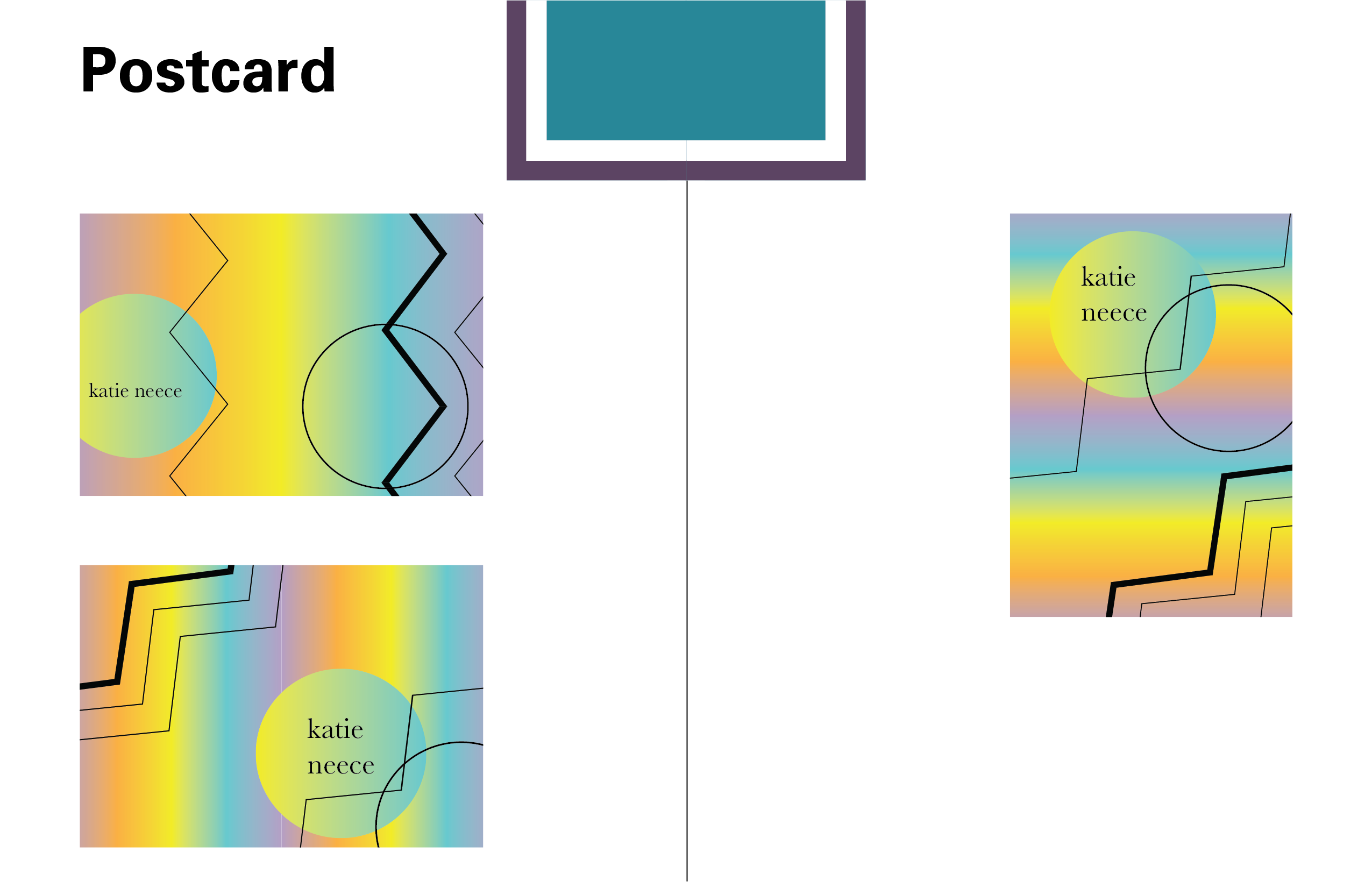
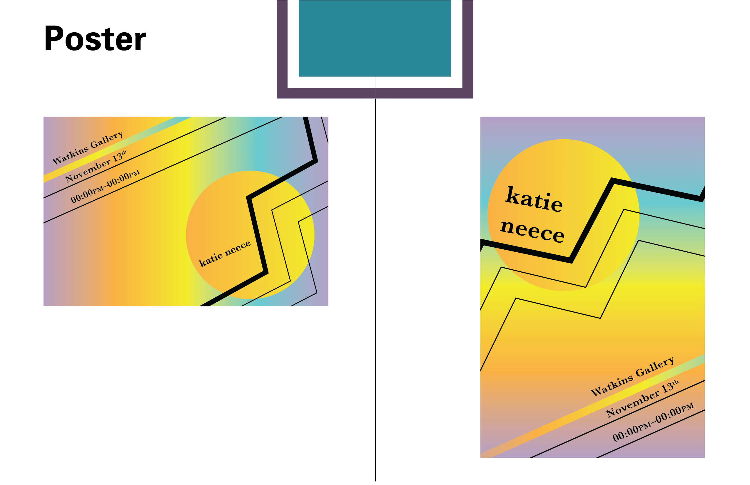
3. Katie Neece, a self-titled exhibit, was made entirely of vector art. it reminded me heavily of the classic 90’s coach-bus seats, or “mall cafeteria brand” aesthetics. Due to the design choices of the art, it was a great time to really focus on linework and color as hierarchal tools.
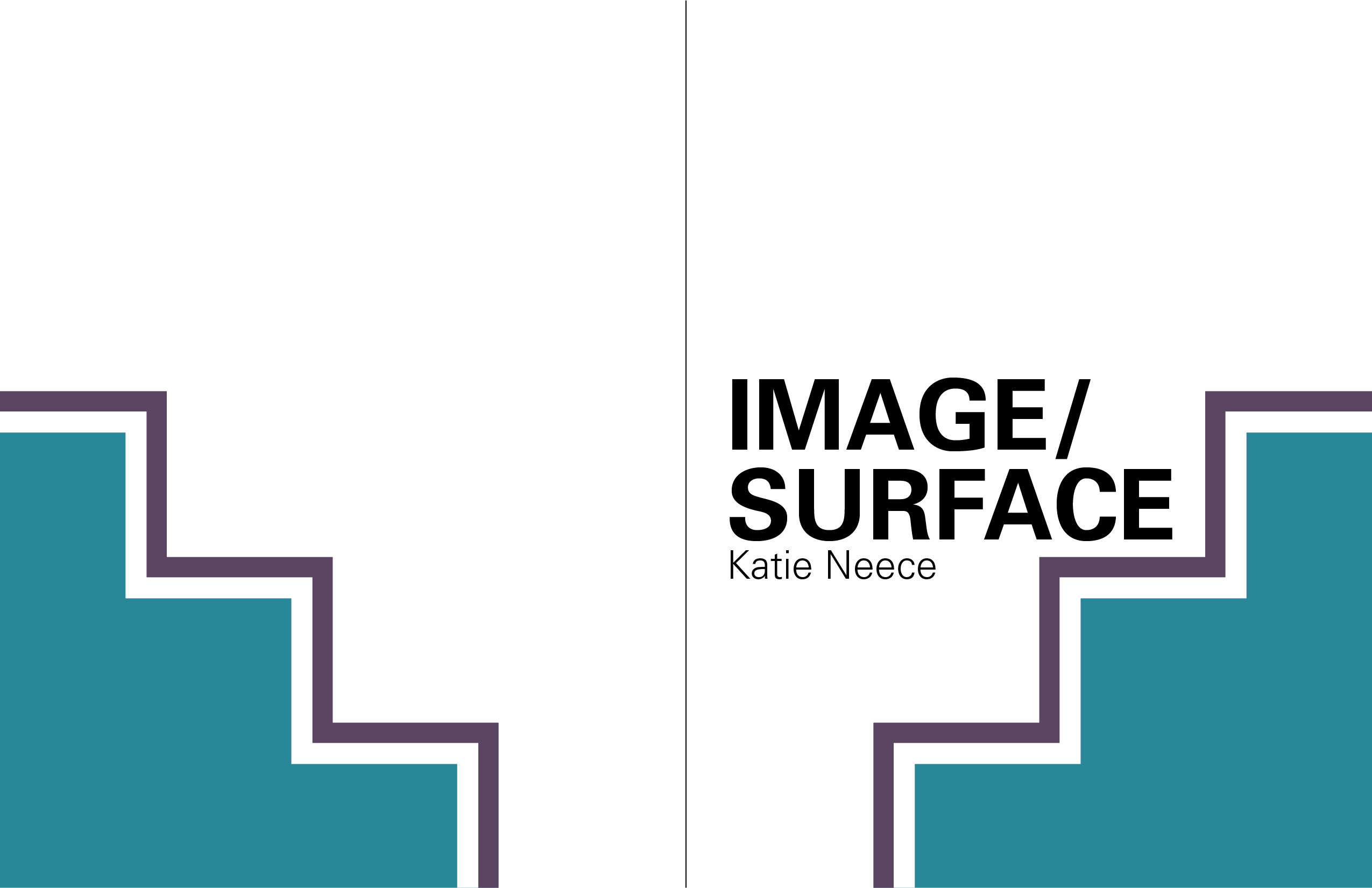
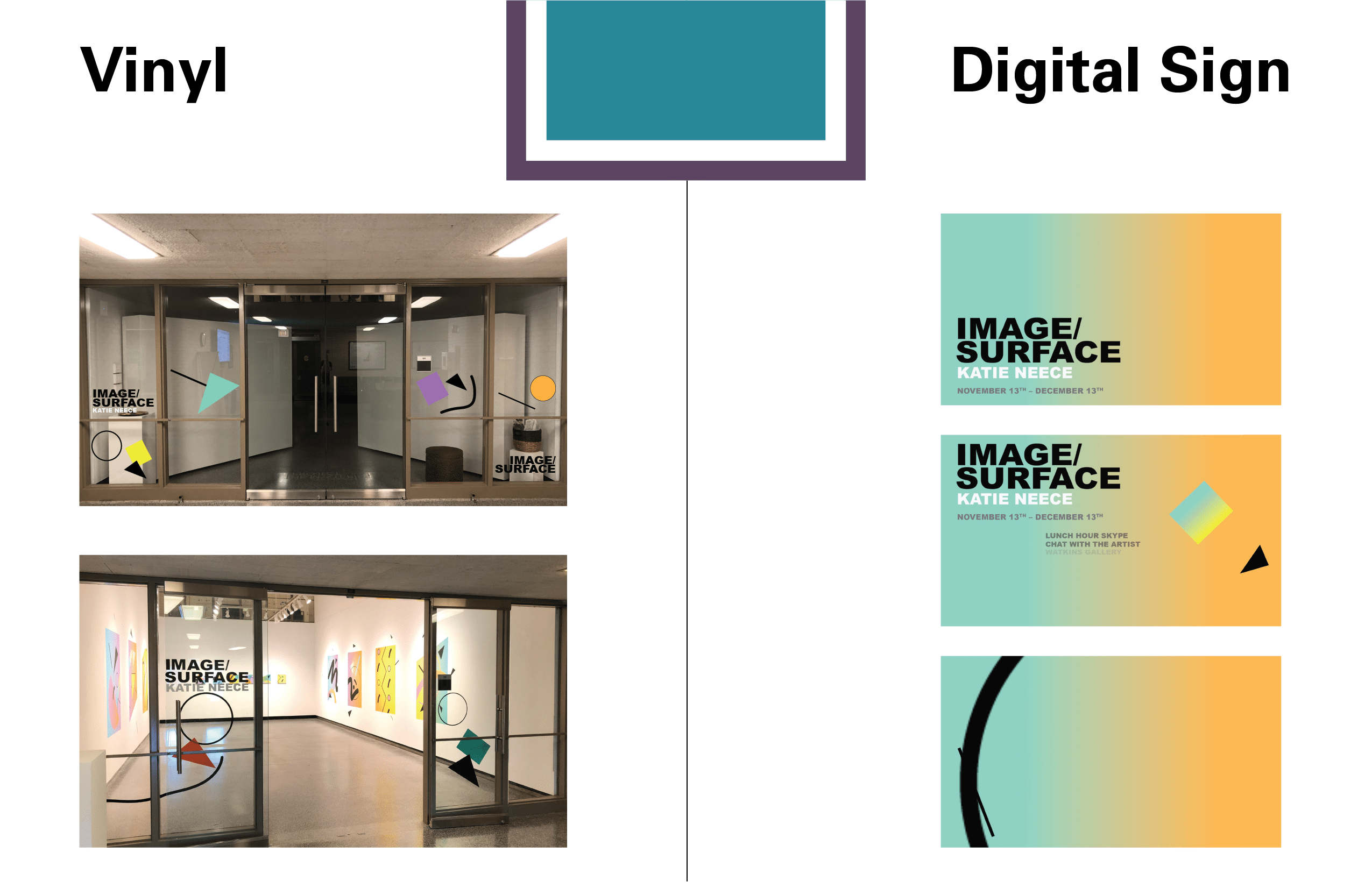
4. Image/Surface was another less successful exhibit of mine, though I was able to do great things with the digital sign for this exhibit.
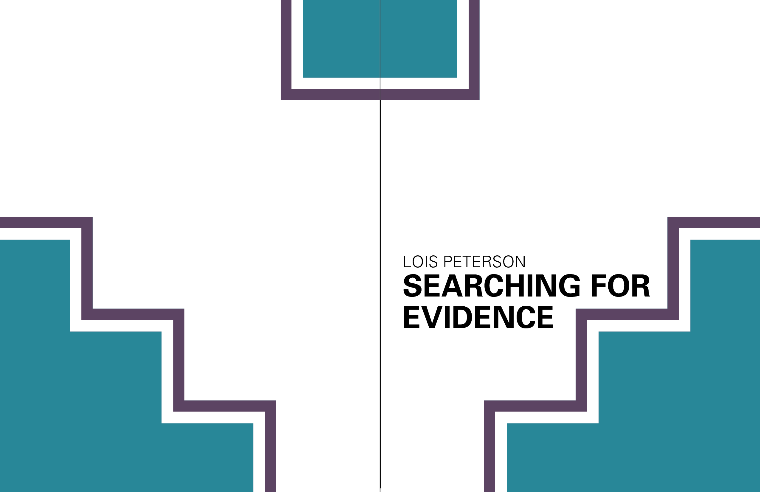
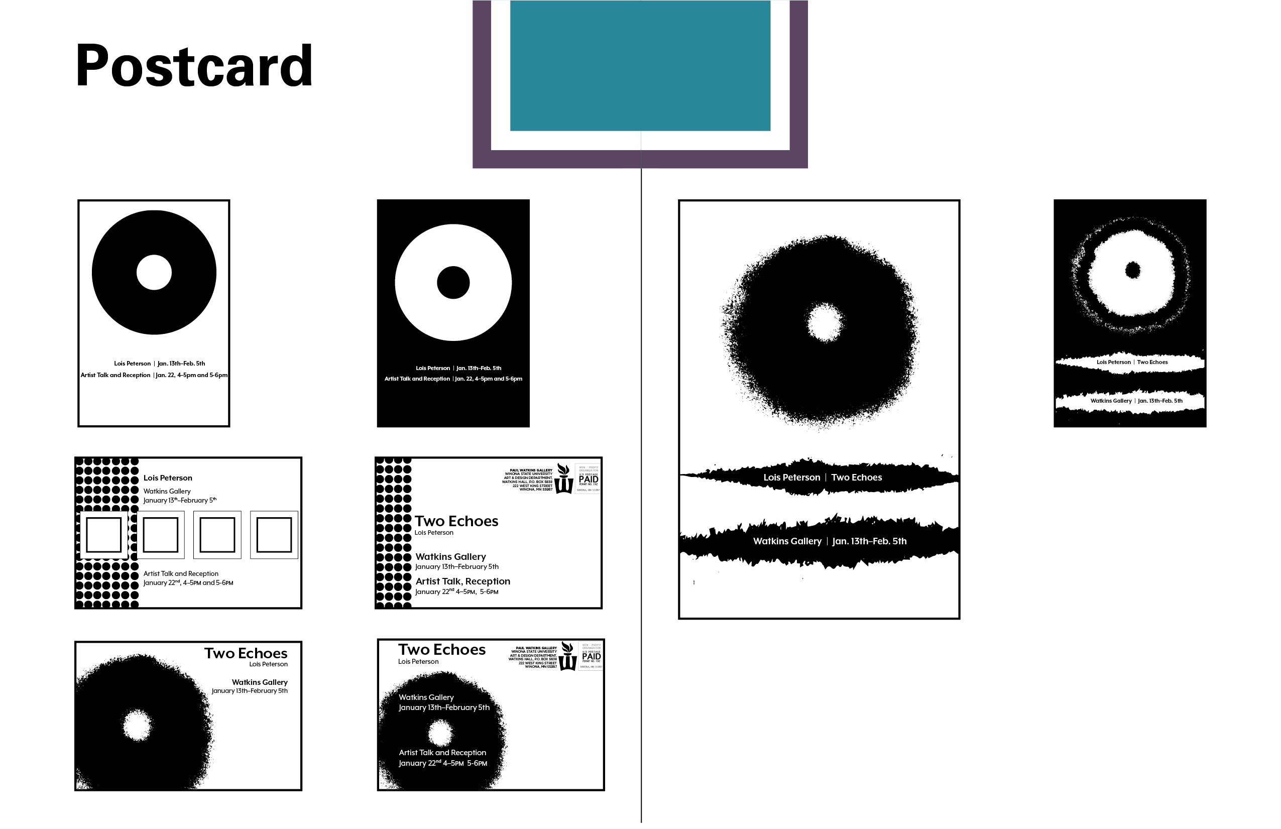
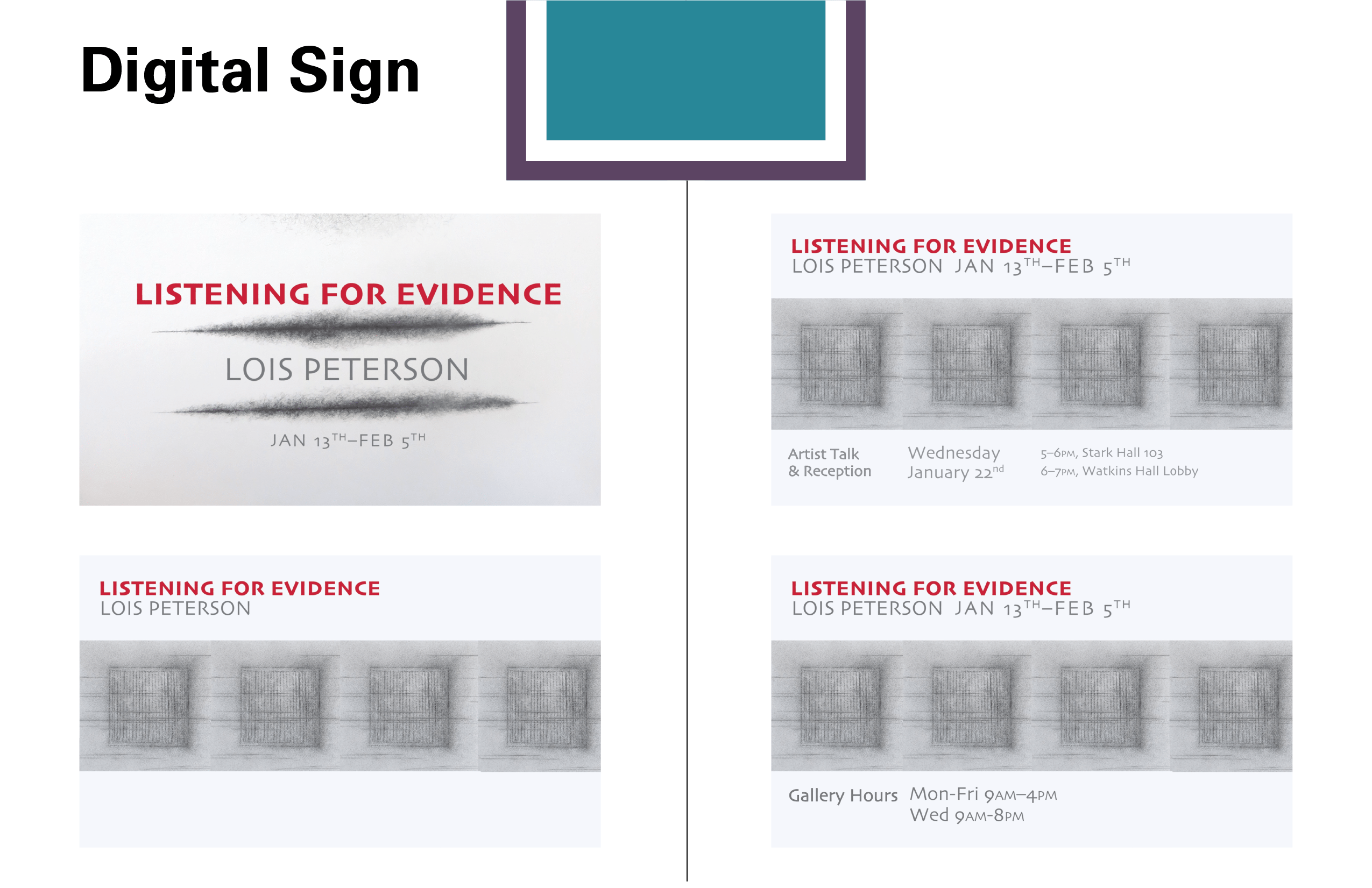
5. Lois Peterson’s exhibit went through some name changes, though the designs I made for this exhibit were very well-liked, even if it wasn’t picked. I’m very proud of the designs on display across the board.
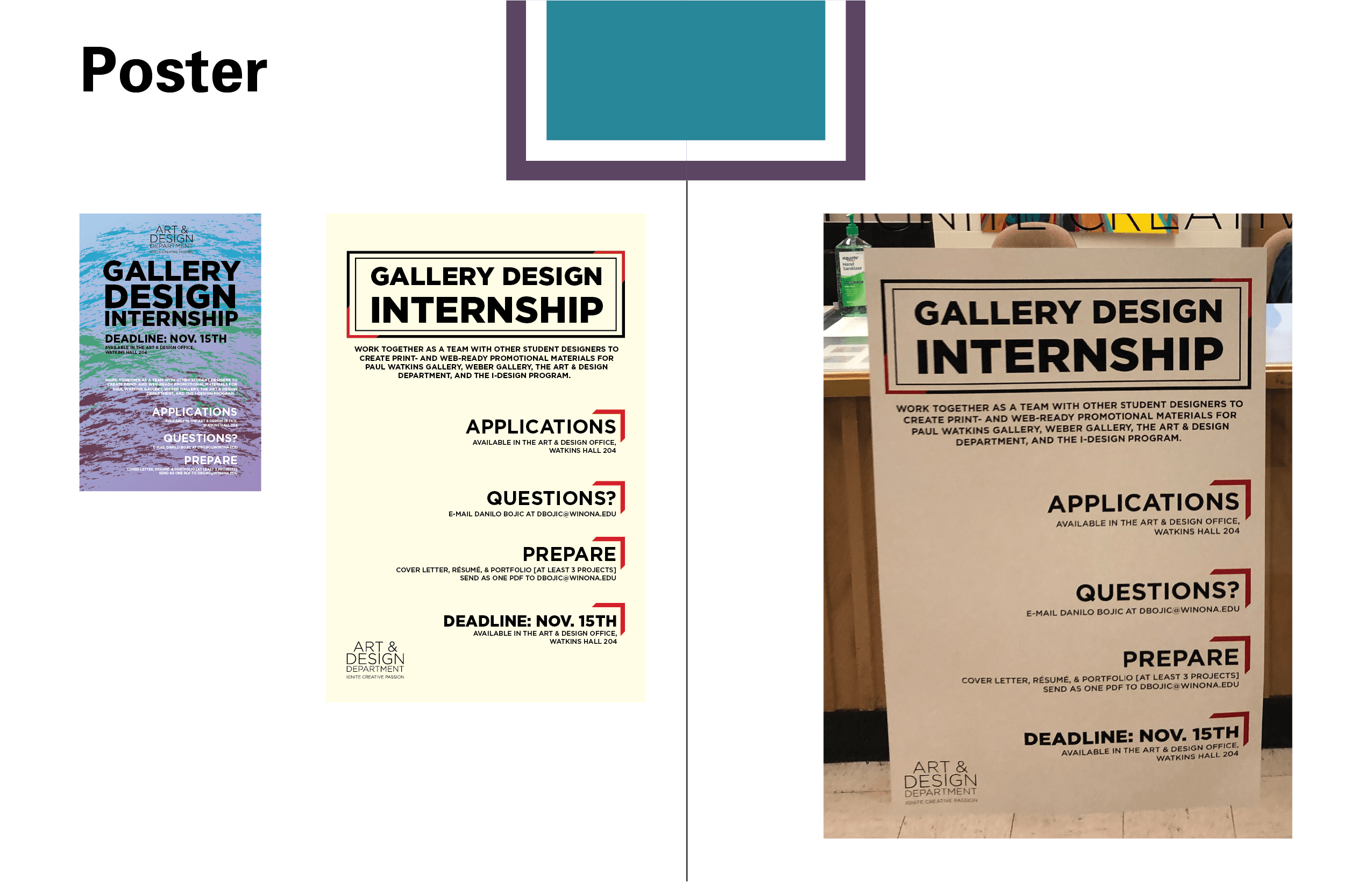
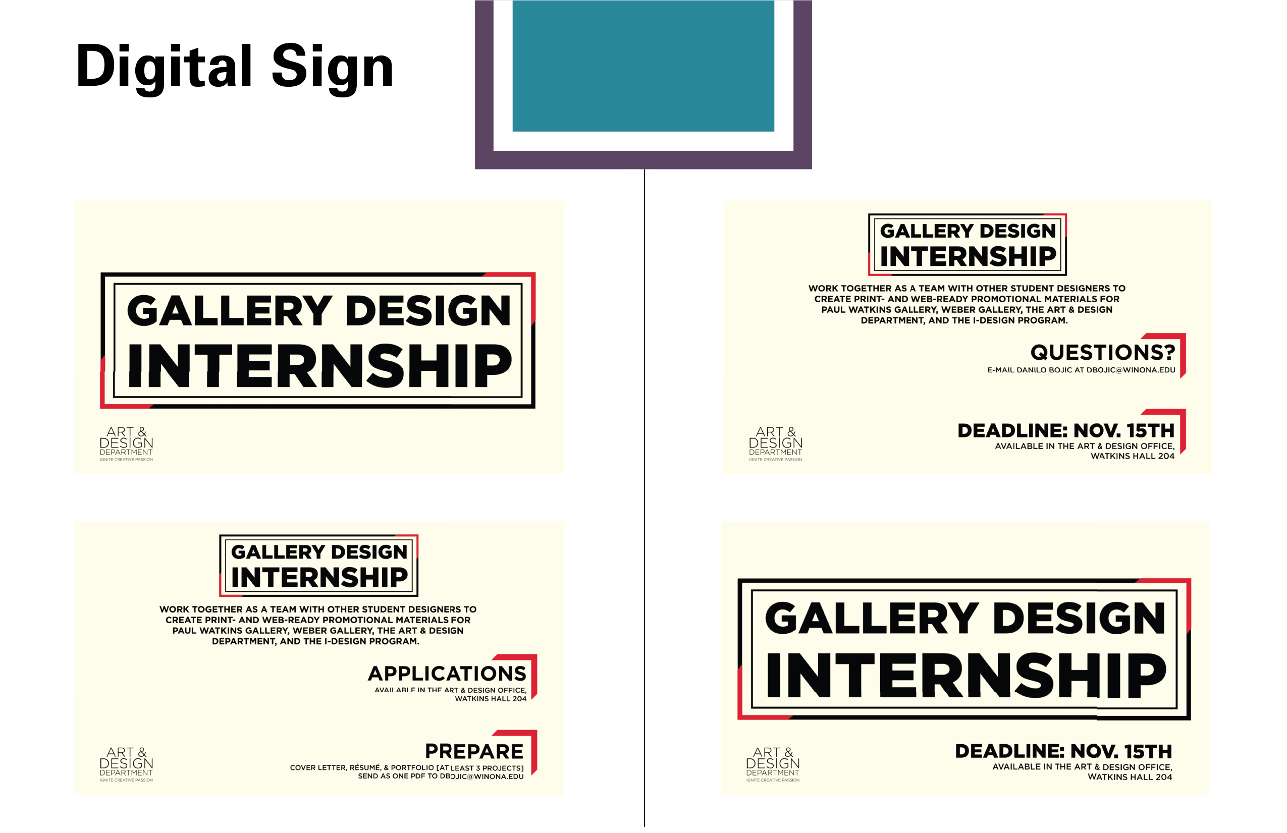
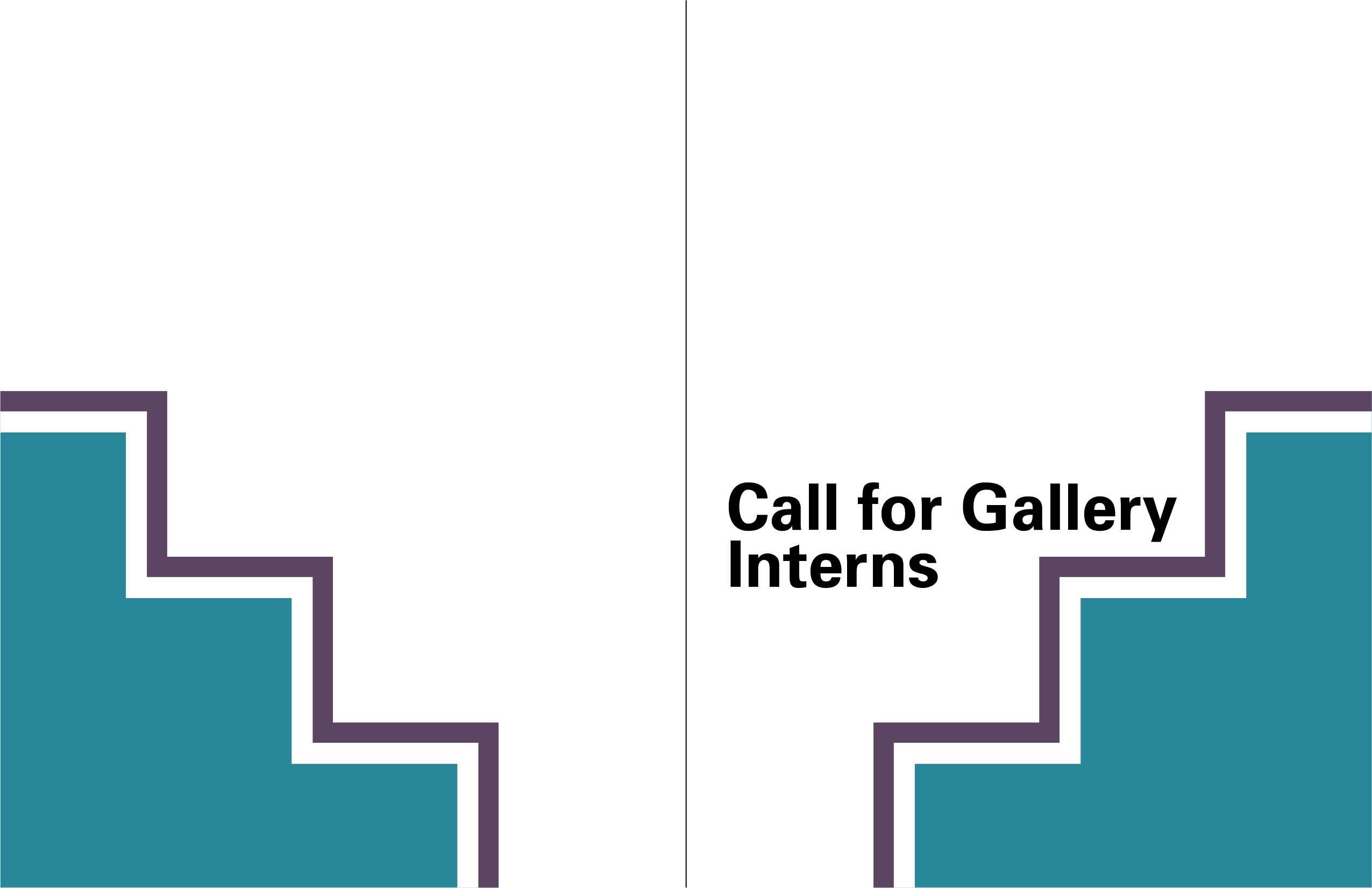
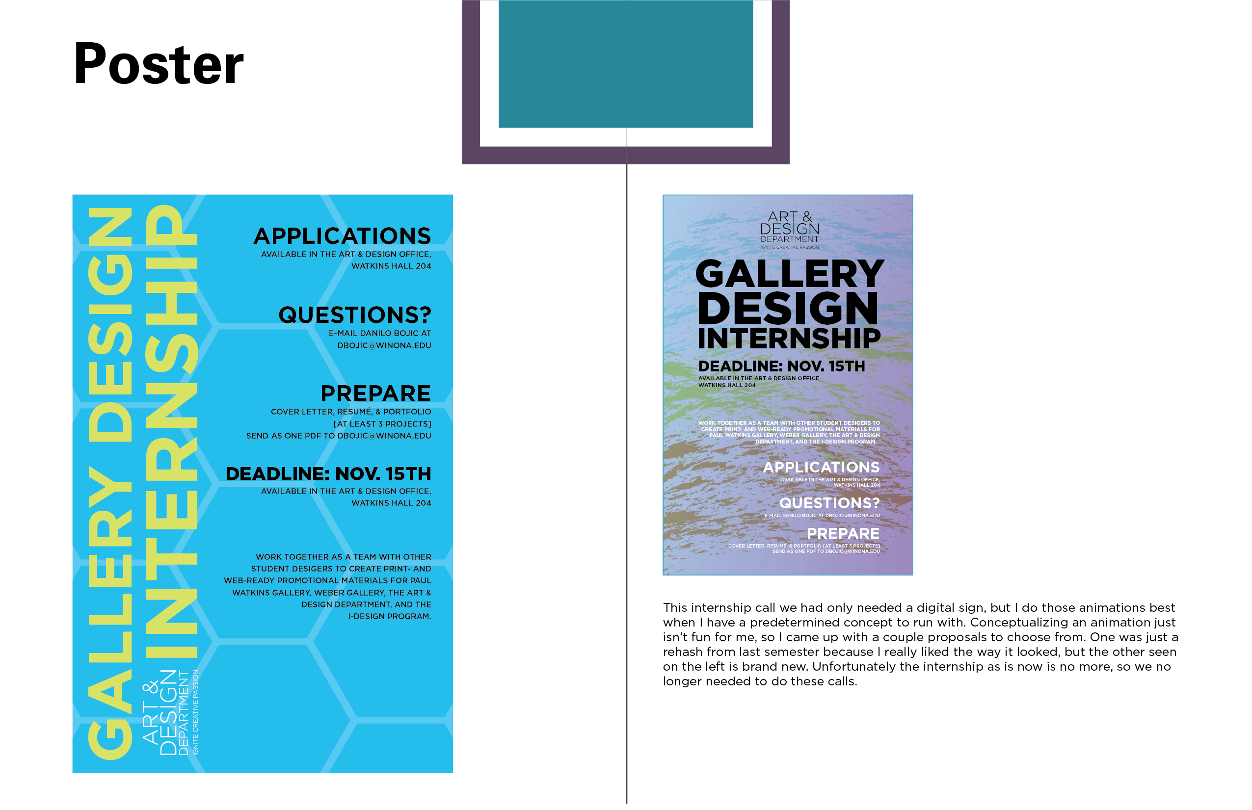
6. The Call for Interns poster was a single-design piece simply trying to attract new interns to the program for the following semester. I followed that same “90’s Mall” aesthetic for one of them, but the more modern, cream colored design won in the end. It also lead to a fantastic digital sign.